
The Font Between Club and League
Why Every Premier League Shirt Speaks the Same Language, And Why It Could Have Been So Much More Unique

In football, we usually talk about crests, shirts, colours and sponsors. Almost never about fonts. And yet, on the back of every player is one of the clearest signs of belonging: the number.
The Premier League understood this back in the late 1990s. From the 1997/98 season, all clubs began using a standardized league font for names and numbers. Before that, each club, often in partnership with its kit manufacturer, could have its own typography. Arsenal looked like Arsenal, Manchester United looked like Manchester United, Liverpool looked like Liverpool.
Then the Premier League decided that at least one part of that visual identity would no longer belong to the clubs. The reason was practical, but also much bigger than that. Numbers and names had to be legible to referees, spectators in the stadium and, increasingly, millions of people watching on television. At the same time, the league was building something that would become one of its most valuable assets: its own visual identity. When a player with a large number on his back appeared on television, it no longer mattered whether he was wearing an Arsenal, Newcastle or Blackburn shirt. The typography was saying something else: This is the Premier League.
The font became a kind of flag for the competition. Since then, the league has changed its font only a handful of times: in 2007, 2017 and 2023. Each new version was more than an aesthetic refresh. Through it, the Premier League controlled how its competition would look on shirts, in stadiums, on television and in stores. Today, the size, style, colour and application of names and numbers are all part of the league's official regulations. And then comes the interesting paradox. Premier League clubs have to give up their own font, but only while playing in the Premier League. The moment they step outside the competition, that identity returns to them.

In the Champions League, Arsenal can use Arsenal's font, Chelsea can use CFC Serif, Liverpool can use its own typography, Manchester City can use its Club Font, and Tottenham can use its own design. The same player, the same shirt, the same number but a different font. The change is almost imperceptible, yet it says a great deal.
In the Premier League, the font belongs to the league. In Europe, the font belongs to the club again.
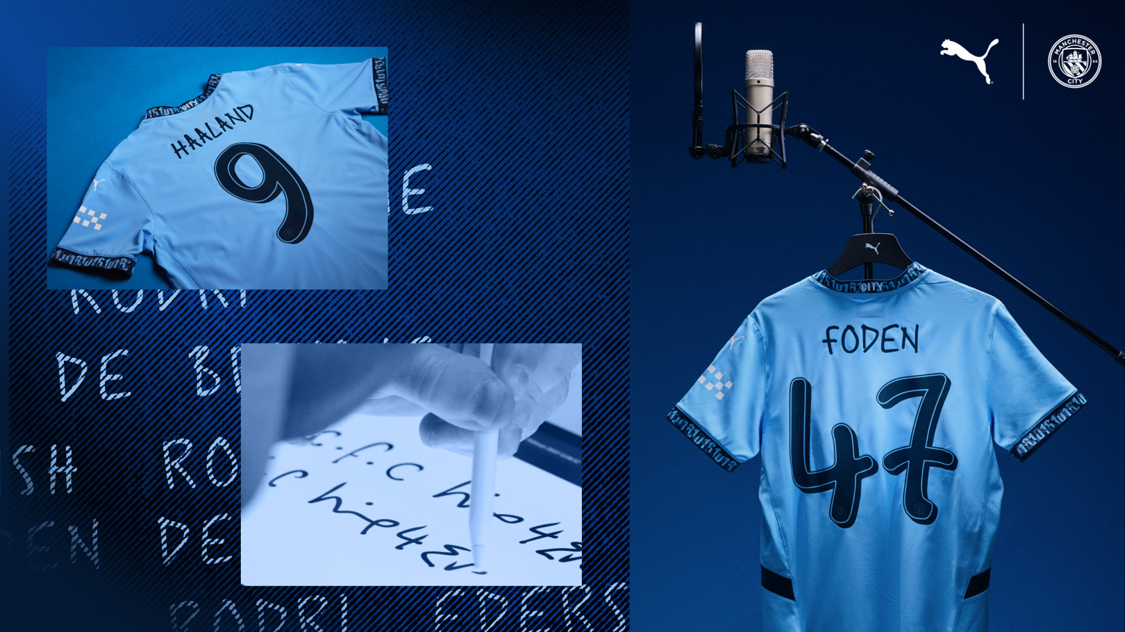
Perhaps the best example is Manchester City. For the 2024/25 season, the club created a special font for the Champions League and domestic cups in collaboration with Noel Gallagher. A lifelong City fan, Gallagher hand-wrote the names and numbers of the players, and his handwriting was then turned into an official font. Think about that contrast: the same club that is required to use a strictly regulated typeface in the Premier League can step onto the European stage a few days later wearing numbers inspired by the handwriting of an Oasis member. That is no longer just design. It becomes a story about who owns identity.

Clubs have never seriously rebelled against the rule itself. After almost thirty years, they have simply grown accustomed to the idea that in the Premier League, the font belongs to the league, not to them. If there is a quiet revolt, it is no longer really about the font itself, but about what comes with it.
Colour is the bigger issue.The Premier League gives clubs only five official colourways: white with black detailing, black with white, navy with white, red with white, and hi-vis yellow with white detailing. On paper, that may seem sufficient. In the real world of football shirt design, it is not always. Manufacturers now create shirts in an almost infinite range of shades: from cream and burgundy to mint green, gold, fluorescent tones and precisely defined club colours. But when that same shirt enters a Premier League stadium, its typography has to fit into one of five predetermined palettes.

And that is where the absurdity begins.The font can be perfectly suited to the club, while its colour may not suit the shirt at all. That is why, at times, a number on a Premier League shirt can look as though it has been pasted onto an otherwise finished design. In other competitions, a club can take the same font, adjust its shade and integrate it almost invisibly into the shirt. In the Premier League, it does not have that freedom.
Fans, too, have shown how much these details matter. When the Premier League font changes, the reaction is not purely aesthetic. People compare old numbers, search for vintage shirts and return to typefaces associated with particular generations of players. The demand became strong enough that in 2025, the retro Premier League font from the 2007–2017 era was officially relaunched.
And this is where you see how early the Premier League understood one thing: A brand is not just a logo. A brand can be the way a number 10 looks. It can be the small lion beneath a player's name. It can be a typeface you recognize before you even read the player's name. The Premier League turned what was once a technical element of football equipment into a symbol of its own identity. It left clubs their crests, colours, shirts and history, but placed a small signature of the competition on the back of every player. Because when Arsenal plays Liverpool, their shirts have to look different. But the Premier League has to look like the Premier League.
There is also another way of looking at it. From an artistic and aesthetic perspective, it is impossible not to wonder how many brilliant, eccentric and genuinely original ideas have been left unexplored because every club has had to speak the same typographic language on Premier League shirts. For almost 30 years, we have seen countless generations of kits, designers, players and sponsors, but only a handful of league-approved ways to write their names and numbers. Perhaps the most interesting font is the one we never got to see.

