
Newcastle United’s New Crest: Why a Minor Redesign Feels Like a Major Story
How Newcastle modernised a historic identity without changing what supporters recognise.

Newcastle United has unveiled a refined version of its club crest, marking the first significant change since 1988. At first glance, the redesign may appear almost identical to the previous badge, and that is precisely what makes it interesting.
This is not a radical rebrand. It is a case study in how football clubs modernise heritage identities without breaking the emotional connection supporters have with the symbols they grew up with.
O4 BRIEF
WHAT HAPPENED?
Newcastle United has unveiled a refined version of its crest, the first update to the badge introduced in 1988. The redesign keeps the club’s recognisable heraldic elements while refining their shapes, proportions and reproduction across modern formats.
WHY DOES IT MATTER?
The project shows how a football club can modernise a valuable heritage asset without replacing the identity supporters already recognise. Newcastle’s consultation found that 84% of respondents preferred updating the existing crest rather than starting again, while 27,348 eligible supporters later voted on the final options.
THE BIGGER QUESTION
If supporters want their club identity preserved, how much can a crest change before it stops feeling like the same club? Newcastle’s answer was to make the badge more precise and adaptable while keeping its essential visual language intact.
SOURCES
Newcastle United Crest Redesign Explained
Newcastle United began reviewing its crest in 2024 after recognising that the 1988 design was becoming increasingly difficult to reproduce consistently across modern platforms. The issue was not that the badge was unpopular. Quite the opposite. It had become deeply connected with the club’s identity, history and most memorable eras.
The problem was technical. Fine details, irregular lines and small elements could lose clarity on mobile screens, broadcast graphics, embroidered shirts, merchandise and other digital applications.
Newcastle's objective was therefore not to replace its identity, but to make the existing one function more consistently across different sizes, materials and formats. That distinction matters. The project was less about creating a new personality for the club and more about improving the performance of an existing visual asset.
Why Newcastle United Did Not Radically Redesign Its Crest
The supporter consultation established clear boundaries for the project. According to Newcastle, 84% of survey respondents supported updating the existing crest rather than creating a completely new design. Supporters wanted the historic elements to remain, including the castle, black-and-white shield, hippocampi, lion, pennon and club name.
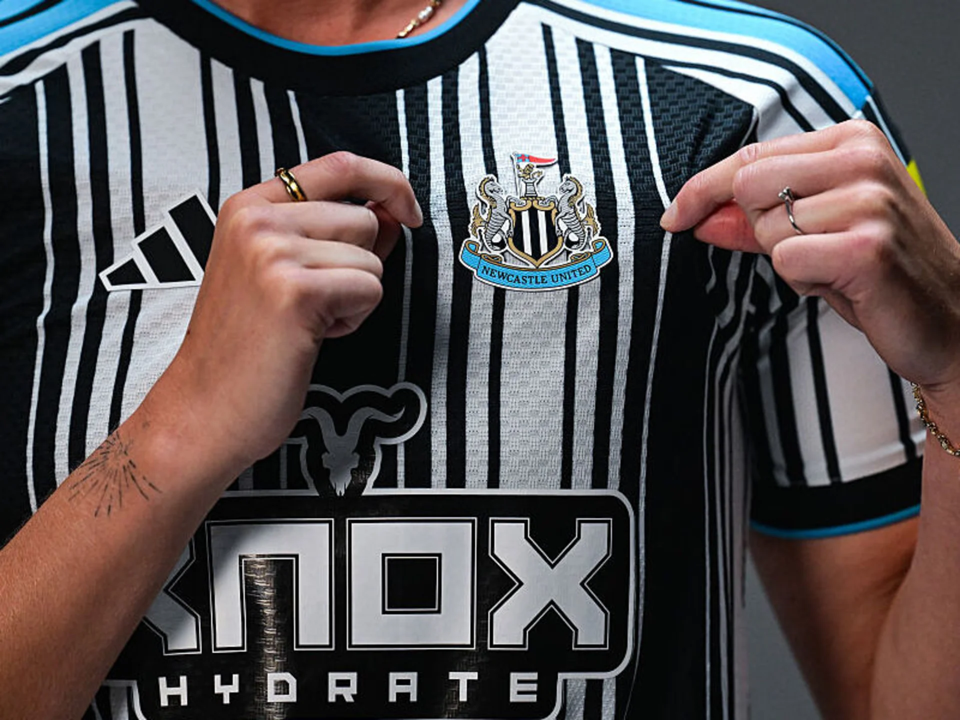
That effectively gave the design team a brief: Preserve the relationship with Newcastle's coat of arms. Keep the recognisable structure of the badge. Improve clarity and consistency. Avoid a generic circular football logo. Do not introduce change simply for the sake of change.
The result reflects a principle that football clubs often struggle to balance: evolve the asset without making the evolution visually theatrical.
Newcastle United Crest Vote and Fan Reaction
Newcastle presented three refined crest options to eligible supporters in August. The independent poll included 27,348 voters, including season-ticket holders and club members. Option C received 64.8% of first-choice votes, compared with 19% for Option B and 16.2% for Option A.
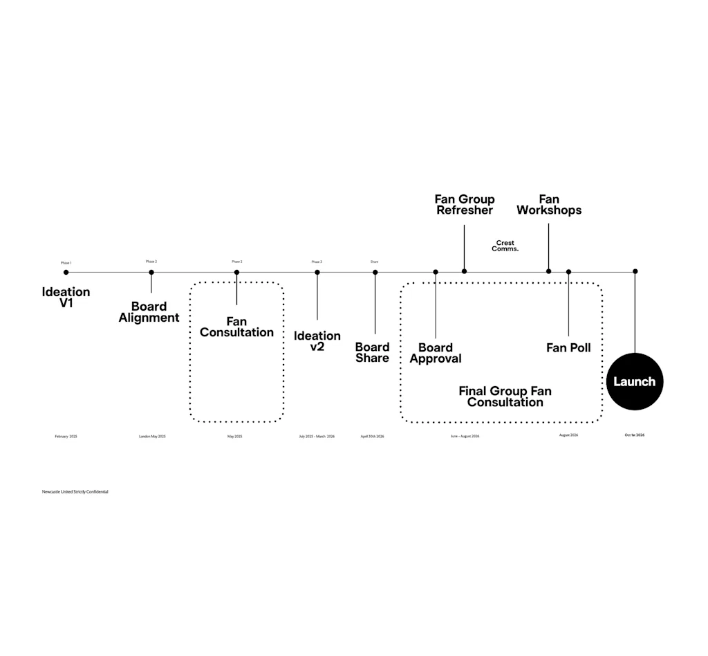
Yet the reaction to the proposed designs highlighted an important communications problem. Some supporters felt the options looked so similar that the vote became a version of "spot the difference". That response reveals a broader tension in football branding. Supporters often demand authenticity and continuity. At the same time, when a club delivers a carefully controlled evolution, the result can be criticised for being too subtle.
The audience may interpret a "new crest" as a promise of visible transformation. The club may understand it as a more precise, flexible and future-proof version of the same identity. Those are very different expectations.
What Changed on Newcastle United’s New Badge?
The redesign is subtle, but it is not meaningless. Newcastle says the castle has been sharpened and made more distinctive. The black-and-white shield has been redrawn, while the hippocampi have been refined. The demi-lion, pennon and ribbon have also been adjusted to create greater balance and alignment.
The new crest has been tested across multiple applications, including small mobile-screen formats, broadcast graphics, embroidery, colour and monochrome versions, physical signage and merchandise.
In other words, the redesign is not primarily about how different the badge looks when displayed large on a website. It is about what remains legible when the crest is reduced, reproduced, animated, stitched or viewed from a distance.
That makes the project closer to a systems-based identity update than a conventional logo redesign.
Why Is the Flag on Newcastle’s Crest a Different Colour?
One of the more noticeable changes is the treatment of the flag held by the lion. It appears lighter and more clearly separated from the surrounding elements than in the previous crest.
Newcastle's published rationale does not identify a new symbolic meaning for the colour change. Instead, the club focuses on refinement, legibility, balance and reproduction across modern formats. The flag remains part of the crest's heraldic imagery and its connection to Newcastle's civic identity and coat of arms.
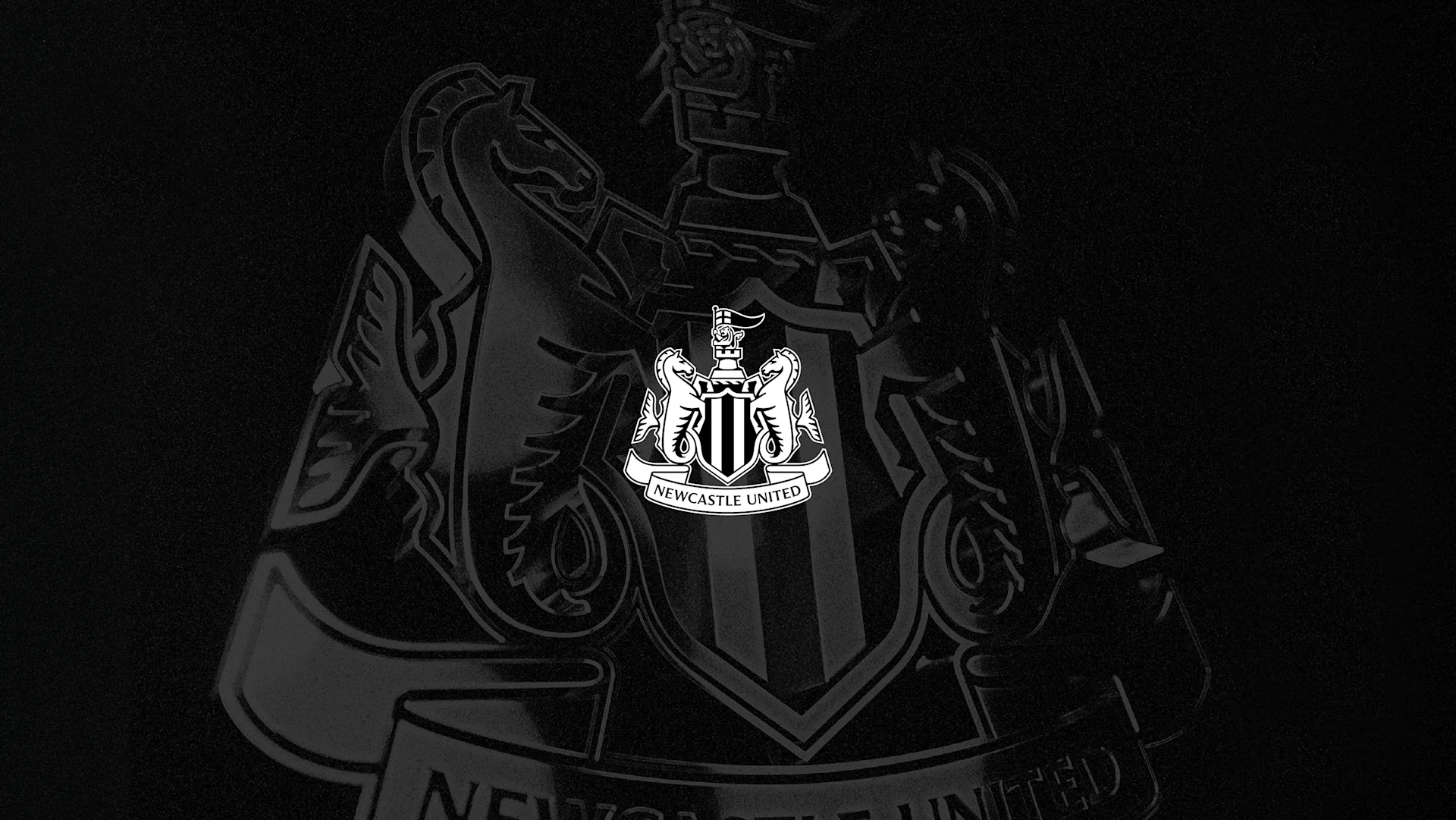
The available evidence therefore points to a functional rather than ideological change. The revised treatment may improve contrast, separate the pennon from the lion and castle, and make the upper section of the crest easier to reproduce at smaller sizes.
The important point is not to assign symbolism that the club itself has not claimed.
Newcastle’s New Crest Shows That Modernisation Does Not Always Mean Change
Newcastle United did not deliver the kind of logo makeover that dominates social media for a week. It delivered a controlled update to a historic badge, one designed to make the identity work better without making it feel like somebody else's club.
That creates an awkward communications problem. The changes may be important to designers, brand managers and digital teams while remaining almost invisible to casual viewers.
But that invisibility is partly the point. The supporters' preferred outcome was never a revolutionary crest. It was a better version of the one they already had. Newcastle's redesign therefore offers a useful lesson for football branding: progress does not always arrive as a new symbol. Sometimes it arrives as a more precise version of an old one.
The challenge for modern football identities is no longer simply to look new. It is to work everywhere the modern football business needs them to work, without making them feel new at all.

