
More Than a Shirt: How Mexican Football Turns Tradition Into Design
From Día de Muertos-inspired typography to culturally rooted football kits, Mexican clubs are finding new ways to bring local heritage into the visual language of the game.

Football shirts have always carried more than the colours of a club. They hold memories, represent communities and turn symbols into something supporters can wear. But in Mexican football, that relationship between identity and clothing takes on a particularly distinctive form every autumn.
As Día de Muertos approaches, the country's football clubs begin to introduce a different visual vocabulary to the game. Marigold flowers, sugar skulls, decorative paper and references to ancient mythology find their way onto shirts, alternative kits and, increasingly, the numbers printed on players' backs.
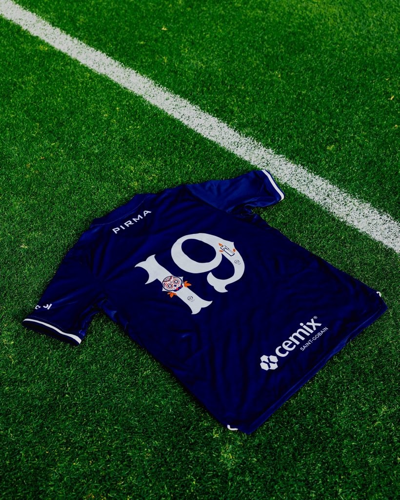
The latest example comes from Cruz Azul, which has introduced a special-edition typography inspired by one of Mexico's most recognisable cultural celebrations. Alongside Pumas, the club is once again demonstrating that football design does not have to begin and end with the badge.
It can begin with the culture surrounding it.
O4 BRIEF
WHAT HAPPENED?
Mexican clubs including Cruz Azul, Pumas and Chivas have introduced Día de Muertos-inspired typography and kit designs for the 2026 season, continuing a growing tradition of culturally themed football apparel.
WHY DOES IT MATTER?
These projects show how clubs can turn local heritage into distinctive visual identities and new merchandising opportunities, making football shirts a platform for cultural storytelling rather than simply sportswear.
THE BIGGER QUESTION
Can football clubs turn local cultural heritage into a lasting part of their identity, or will traditions like Día de Muertos eventually become just another seasonal merchandising opportunity?
SOURCES
Día de Muertos and Mexican Football: When Cultural Identity Meets the Pitch
For Mexico, Día de Muertos is not simply another date on the cultural calendar. Celebrated primarily on 1 and 2 November, the tradition brings families together to remember relatives and loved ones who have died. Its visual language is instantly recognisable, but its meaning goes considerably deeper than its colourful appearance.
Families create ofrendas, or offerings, decorated with photographs, candles, food and flowers. Among the most recognisable elements is cempasúchil, the bright orange marigold whose petals traditionally help guide the spirits of the deceased back home. Sugar skulls, known as calaveras, and papel picado, the intricately cut decorative paper, complete an aesthetic that has become internationally associated with Mexican identity.
The cultural significance of the celebration is recognised by UNESCO, which inscribed the Indigenous festivity dedicated to the dead on its Representative List of the Intangible Cultural Heritage of Humanity in 2008.

For football clubs, this provides something more meaningful than a seasonal graphic theme. It offers an opportunity to connect their visual identity with traditions that exist beyond the stadium, beyond the competition and, importantly, beyond the commercial calendar.
The distinction matters. A generic Halloween-inspired shirt can borrow familiar imagery. A Día de Muertos design, when approached with cultural understanding, can communicate something specific about the place and people a club represents.
Cruz Azul and Pumas: Día de Muertos Typography in Liga MX 2026
The latest examples arrived ahead of the 15th round of Mexico's 2026 Apertura tournament, with Cruz Azul and Pumas presenting different interpretations of the celebration.
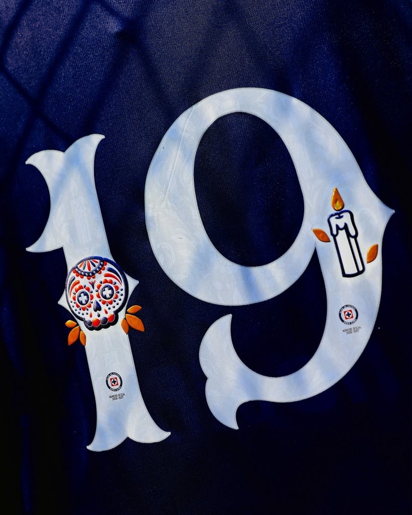
Cruz Azul's approach is particularly interesting from a graphic design perspective. Rather than introducing an entirely new shirt, the club has developed special-edition player numbers for its blue Pirma 2026/27 home kit.

The white numbering incorporates a colourful calavera decorated in red and blue, with details referencing the club's emblem. A lit candle and scattered orange cempasúchil petals complete the composition. The result transforms an otherwise functional element of the shirt into a small commemorative illustration.
There is also a commercial dimension. Cruz Azul has made the special numbers available as heat-press applications through its La Noria club store and stadium shop, allowing supporters to personalise their shirts with the commemorative design.
Pumas has taken a different route. Its special numbers combine purple and gold, with colourful skull illustrations filling the digits. The typography is intended for the club's match against Puebla, giving the design a presence within an official Liga MX fixture. Unlike Cruz Azul, Pumas has not announced commercial availability for the numbers.

Two clubs, two graphic approaches, but the same underlying idea: the identity of a football shirt can be developed through details that are often overlooked.
And that is where this year's releases become more interesting than a conventional special-kit announcement. The numbers themselves become the canvas.
Mexican Football Kit Design: From Charly's 2020 Collection to Puebla's Cultural Tribute
The relationship between Día de Muertos and Mexican football design did not begin with the latest Cruz Azul release.
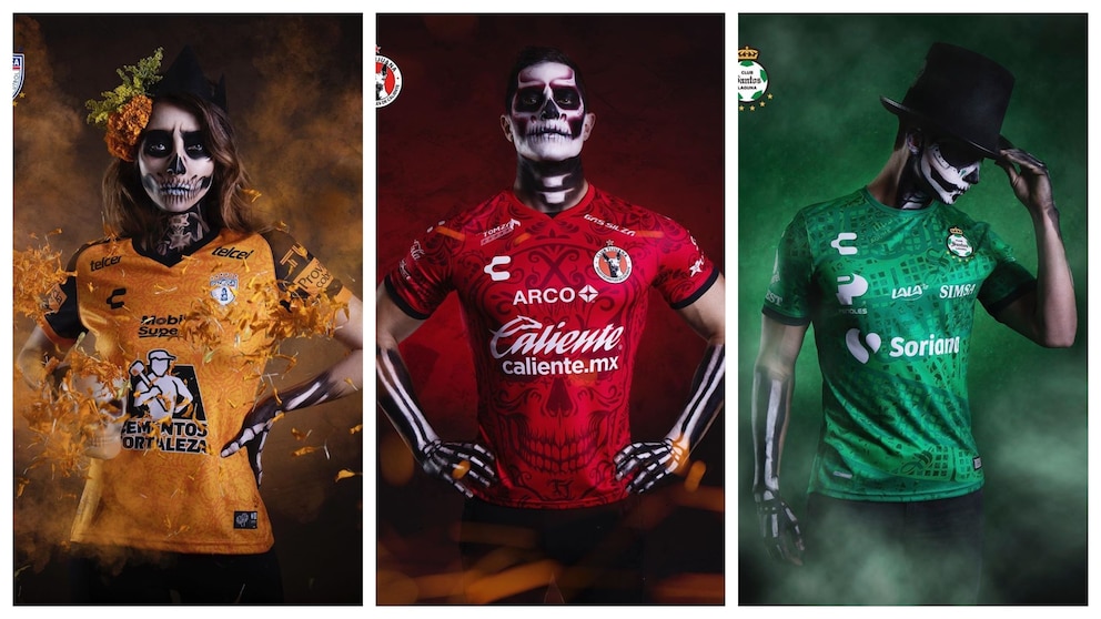
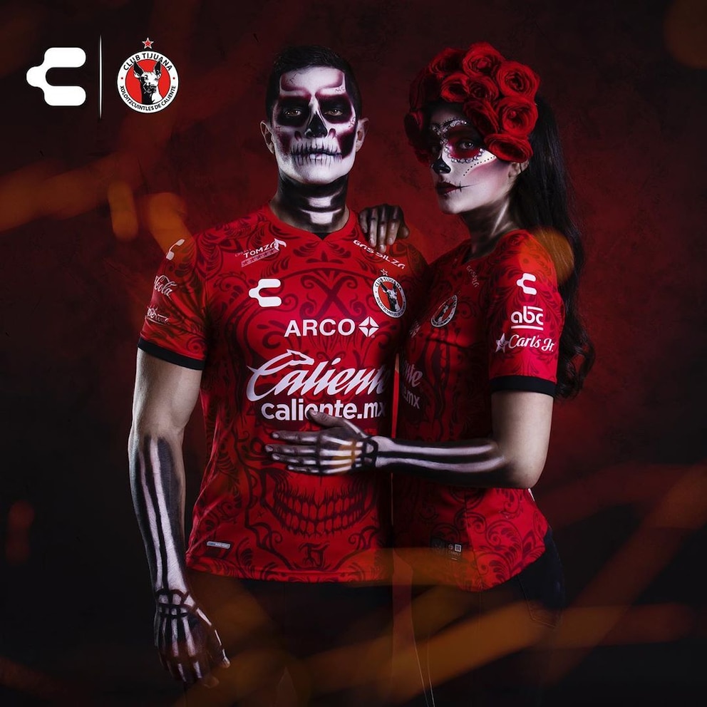
One of the clearest examples came in 2020, when Mexican sportswear manufacturer Charly developed a coordinated collection of commemorative shirts for five Liga MX clubs: Atlas, Pachuca, Querétaro, Santos Laguna and Tijuana.

Rather than applying one identical graphic across five different teams, Charly translated different elements of the celebration into individual club designs.
Atlas used imagery inspired by sugar skulls. Pachuca adopted the orange tones of cempasúchil. Querétaro drew on La Catrina, the iconic female skeleton figure associated with the celebration. Santos Laguna incorporated patterns inspired by papel picado, while Tijuana referenced Mictlantecuhtli, the Aztec deity associated with the underworld, and Xólotl, a figure connected with the journey of the dead.
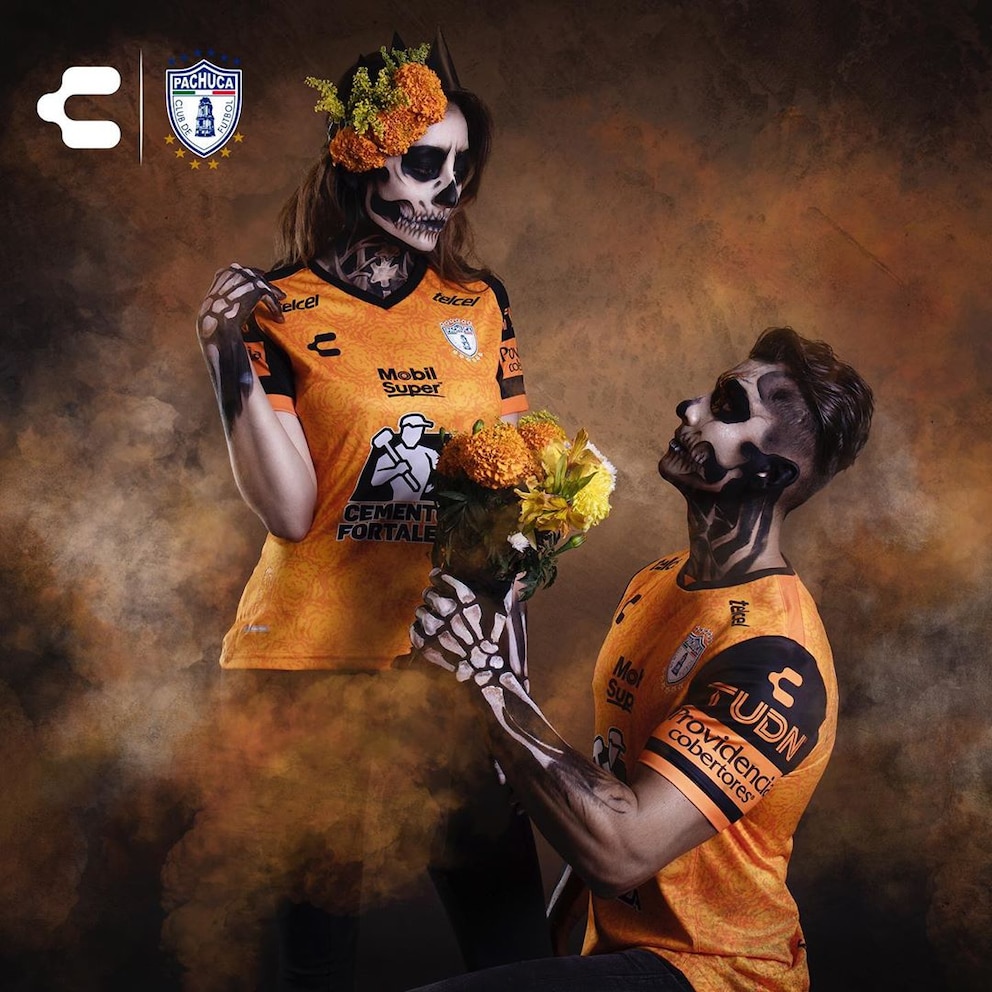
The collection demonstrated how a shared cultural concept could produce five distinct visual outcomes. It also highlighted the role of a domestic sportswear manufacturer in developing a design language that was rooted in its own market rather than imported from global football trends.
Another notable example arrived in 2024 with Club Puebla and Pirma. The club introduced a special third shirt inspired by the traditional papel picado of San Salvador Huixcolotla, a community in Puebla known for its paper-cutting tradition.
The shirt incorporated the distinctive blue stripe of Puebla alongside cempasúchil-inspired details. The club described the project as a tribute to the identity and work of the local community, using the phrase tradiciones que trascienden — traditions that transcend time and borders.
That detail is important. Instead of treating Mexican culture as a collection of decorative symbols, the project connected the design to a specific place and the people responsible for preserving its traditions.
Chivas, Atlético Morelia and the Expanding Día de Muertos Football Design Movement
The latest releases suggest that this visual approach is continuing to develop across Mexican football.
Chivas Guadalajara introduced special-edition numbers for the 2026/27 season under the concept Soy Chiva Hasta los Huesos. Developed in collaboration with Mexican artist Sofy Lupercio, the typography combines colourful folk motifs, calaveras, flowers, papel picado and references to the club's identity. The goat imagery associated with Chivas is integrated into the skull illustrations, making the design specific to the institution rather than simply applying a generic Día de Muertos pattern.

At a different level of Mexican football, Atlético Morelia has also joined the 2026 celebrations. Working with sportswear brand Keuka, the club presented a commemorative shirt featuring purple tones, orange cempasúchil details and an illustration of a catrín with butterfly wings.
These projects demonstrate that the concept is not limited to the country's most commercially prominent clubs. It is becoming a broader creative opportunity for teams operating in different competitions and markets.
There is also an important difference between the formats. Some clubs choose to redesign an entire shirt, others introduce a limited-edition alternative kit, while some focus exclusively on typography. Each approach offers a different balance between visual impact, production and the commercial potential of a commemorative release.
What connects them is the decision to use football apparel as a platform for cultural expression.
Football Shirt Design and Sports Marketing: The Business of Cultural Identity
The commercial appeal of special-edition football shirts is easy to understand. They create a reason for supporters to consider a purchase beyond the standard home and away collections, while offering clubs and manufacturers a fresh storytelling opportunity.
But the more interesting question is not simply how many additional shirts these releases can sell. It is what makes them worth paying attention to in the first place.

A standard football shirt is largely built around continuity. Its colours, badge and general design language must remain recognisable from one season to the next. A commemorative release has more freedom. It can introduce a different palette, explore unfamiliar graphic techniques and tell a story that would not necessarily fit within the traditional visual identity of the club.
Typography is particularly effective in this context. A special number can be introduced without replacing the shirt itself, allowing clubs to create a distinctive product through a relatively focused design intervention. Cruz Azul's decision to offer its Día de Muertos numbers as separate heat-press applications is a good example of this approach.

The model also creates opportunities for collaboration. Chivas working with Sofy Lupercio shows how clubs can bring external creative voices into football merchandise, while Charly's 2020 collection illustrates how a manufacturer can develop a common cultural concept across multiple teams.
There is, however, a line between cultural storytelling and seasonal commercialisation. The use of traditional symbols does not automatically make a design meaningful. Without a clear connection to the community, history or context behind those symbols, a cultural reference can quickly become little more than a decorative marketing device.
The strongest projects are those in which the story is visible in the design itself and supported by a genuine relationship with the culture being represented.
Why Local Culture Matters in the Global Football Kit Industry
Football is an increasingly global commercial product. The same major sportswear brands operate across multiple leagues, international markets and supporter communities. Shirt launches are often built around familiar marketing formulas, while the visual language of the game becomes increasingly interconnected.

In that environment, local identity can be a competitive advantage.
A shirt inspired by Día de Muertos carries a meaning that cannot simply be reproduced by changing the colours of another club's kit. Its visual elements are connected to a particular cultural context, giving the product a story that extends beyond the team wearing it.
The same principle can be applied elsewhere. Football clubs can draw inspiration from local architecture, music, craftsmanship, regional landscapes, historical movements and community traditions. These references offer possibilities for design that are more distinctive than another variation on a standard geometric pattern.
The challenge is to approach those references with care. Cultural identity should not become a shortcut to visual originality, nor should a community's traditions be reduced to a collection of marketable symbols.
For Mexican football, Día de Muertos offers a particularly compelling example of how this relationship can work. The strongest designs do not simply borrow the appearance of the celebration. They translate its symbols into a football context while retaining a recognisable connection to the culture that produced them.
Cruz Azul's latest typography may occupy only a small part of a football shirt, but its significance goes beyond the size of the graphic. It shows that the identity of a club can be communicated through details that are not traditionally considered central to kit design.
Sometimes, the most interesting part of a football shirt is not the badge, the sponsor or even the colour. It is the story behind the number.
The story ends here.The conversation doesn’t.
Every Sunday, O4 members step outside the four lines to answer The Bigger Question.

